So I went to the local Albertsons and 99 cent store to find some good and bad package designs. For the bad I was trying to find something that had a bad function besides just being painful to look at. Lets start with the bad..
Bad
Cant tell what this is? I couldn't either at first. (strike one)
Its Serenitea shampoo. Its so poorly designed that even holding it against a white background doesn't help its readability. (strike two)
This is the back. You cant tell huh? (strike three. You're out.)
Next is Twist!
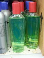
Because you literally have to twist the cap off. This green one is a body wash. I don't know about you but I think it is a major hassle to have to twist the cap off, squeeze the liquid onto your hand or your loofa and then twist the cap back on. After all, we only have two hands... both of which are required to twist this cap off so how are we suppose to hold the loofa?
This is a mouth wash. It's bad because it doesn't come with a little cup for you to pour the liquid into before you pour it into your mouth. You now have to resort to getting your own cup or just pouring it straight into your mouth to rinse. Well you may not see the problem with that but one, it inconveniences you as the consumer and two, imagine if you're not the only one using this mouth wash. At least with a provided cup, you can wash the cup.
This is root beer. Couldn't tell huh? When I walked by it, I thought it was beer. The label is embedded into the bottle so it doesn't stand out. At first glance, you don't see the label at all.
This is something that is more for humor. The cookies are chocolate waffle cookies but the unusual cropping of the girl on the cover is just false advertising.
Now for the good.
Good
These are Starbuck's chocolate. The packaging is very eye-catching and the uses of the color just reminds you of Starbucks.
Here's another Starbucks Chocolate. The design is simple yet elegant.
I've always been a fan of Febreze. They have a distinctive look when it comes to their products. Take theses air fresheners for example. They're very simple looking yet they are super easy to use. Unlike other air fresheners where you have to use your thumb, Frebreze air fresheners has a trigger spray. Its also easy to tell the differences between each fragrance.
Everyone probably saw this one coming. It's method. I love everything method produces. This is a hand wash. They took a simple shape (water drop) and turned it into a bottle. The colors they use are also very clean and eye-catching. They have proven that great design doesn't need to be super fancy. Minimalism goes a long way.


