art 446 final project
ok so, for the final project, dvd/blueray/cd packaging, I decided to do Teenage Mutant Ninja Turtles. (the 3 movies and maybe the animated movie) Yay! exciting. :]


heres another version of the potential logo. This one may be able to be easier to read. colors are still up in the air.
446: thumbs four paws
|
|
|
10
comments
Just to recap, I'm doing Four Paws. This company basically makes everything for animals, esp dogs and cats. I'm going to be focusing on the dog shampoo for this project.
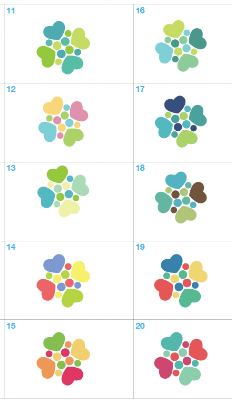
These are some of the logos I'm experimenting with. I'm not completely set on this but everything else i tried doesn't seem to be working. I thought this was a clever idea, theres four paws (hence the name of the brand) and the hearts symbolizes the love for your pet. Its also like putting your hands together (teamwork) but instead of hands, they're paws. I haven't worked with type yet but I'm thinking about some san serif. Tell me what you think and help me pick a color please!
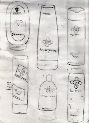
here are my structures/layouts. sorry they're so rough. hope everyone can make sense out of them.
These are some of the logos I'm experimenting with. I'm not completely set on this but everything else i tried doesn't seem to be working. I thought this was a clever idea, theres four paws (hence the name of the brand) and the hearts symbolizes the love for your pet. Its also like putting your hands together (teamwork) but instead of hands, they're paws. I haven't worked with type yet but I'm thinking about some san serif. Tell me what you think and help me pick a color please!

here are my structures/layouts. sorry they're so rough. hope everyone can make sense out of them.

341: software packaging
Heres my rough comps for software packaging. I decided not to change the logo since I don't completely hate it. I wanted to go with something simple yet contemporary. My two favorites are the first and second. Tell me what you think. :]

341: panel discussion
panel discussion went pretty smoothly last tuesday. The speakers were great. They were all very honest. They told us about their struggles and successes. Dominique went from almost rock bottom to the top. It was really amazing to hear her talk about that and it really gives the view hope that they can do it too. Max, although he went over an hour, was the most informative. All the things that your taught not to do in college you will be doing in the real world. It was good to hear from csun alumni because they went through what were going through now. We can relate to them better.
Thanks to everyone to came. :]
341: software packaging
Hello all! So my Software that I am redesigning is called Instant Immersion. Its a software that teaches you other languages. Here is there current packaging.


okay here are my thumbs. I wanted to keep it simple and clan with lots of negative space. Hope you can read my little scribbles. X_x


Don't forget that Panel Discussion is tonight at 6:30! There will be lots of yummy food. Hope to see you then! :D
341: billboard, bus wrap, and stationery
Heres my billboard, bus wrap and stationery.
for the billboard, it was too chaotic at first so i tried to time down the waves and make the text bigger.. not sure if its working. /:

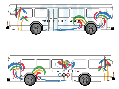
for the bus wrap, I was having trouble figuring out where to put the logo so I put it in the back.. is it working?

And heres my final stationery.
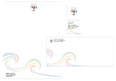

feedback please! :]
446: revised comps
Heres my revisions for yamamotoyama. In case you forgot, its a tea brand, and I am doing the loose leaves for it. Here is initially the bottle and the cover of the hanging label. The top piece is a cork, the logo would be a sticker. The size is roughly 8 inches tall and 2 inches wide. Tell me what you think. :]

341: billboard and bus wrap.
Hey all!
Here's my billboard and bus wrap. I wanted to make it fun and colorful since thats my interpretation of Hawaii. Is it too busy? Feedback welcomed. :]


Also! SAGA's first meeting is tuesday, Feb 17 at 5 o' clock in room 333. Hope to see you there. :]

Emerge
AIGA's second annual Emerge Student Exhibit was held at LMU. Amazing campus... they can work a bit on their environmental design though.

This is actually what you see when you leave Emerge. I thought it was amazing.

I forgot which school this came out of but throughout the show, I realized that CSUN designs are more practical where as other school design to make things look pretty and cool. Im not sure if I would call this graphic design although it does look pretty cool.

This is our professor Joe's piece. Joe is a graduate student at Cal State LA so he still qualifies to be in the exhibit. Pretty cool piece huh?

I think this also came out of Cal State LA but I'm not too sure. These are Adobe CS4 promotional pieces.

One of my all time favorite, this is made by Pui from CSUN.

This one is made by Randall who also comes to CSUN. This really doesn't do the piece justice. Its just so much more amazing when its actual size and printed with the unique fold.

I forgot where this one came from. It looks pretty cool but I don't really see a purpose to having it 3D.

Another piece by professor Joe. And yes, that is my face on his piece. xD

Probably best of show in my opinion. Its so pretty but its completely unpractical and will actually cost Converse way to much money to produce this for the market. It would have been ten times cooler if they actually put a pair of converses in there.

Finally, here is our very own winner from CSUN. Its kim! Horray! Her piece is amazingly adorable and well designed. Tell her congrats if you see her.:]
341: revised logo
Hellos!
So I tried Jahaira's suggestion about losing the black outline around the fish. What do you think?

341: logos
Hello all! Well I originally wanted to do Kauai but I have come to realize that it may be difficult to use only that city for the Olympics so I decided to switch to Hawaii instead and utilize all of the islands. (People would be traveling to different islands for each event) These are the logos I came up with. the left column is the evolution process of my fish. I really liked number 3 but I thought it would be better to actually use the Hawaii state fish for the logo instead. (If your not sure how the state fish looks like, I included a picture at the end) The rest is just the icon with my experimentation with type. I feel like just having the text underneath the fish works best. I think I like number 11 the best. What do you think?

Heres the Hawaiian Trigger Fish for reference.

thanks for looking! :D
446:: thumbs yamamotoyama
Hello all! Here are my thumbs for the new logo of yamamotoyama. let me know what you think :]

Also did some structure/layout thumbs for the new rebranding.


Hope my sketches are clear.. and sorry again for the smudges. ~.~
Feedback is welcomed. :]
Also! Remember to come to SAGA's open house tonight at 6:30 in the purple crit room. There will be free pizza! :D
341: thumbnails

I'm doing Kauai for the Olympic logo. Sorry for the muddiness of my comps. I'm a lefty so my hand just smudges everything. I wanted to give it the tropical beach feel since thats what the location is about. Thanks, see you in class. :]
446: the good and the bad
So I went to the local Albertsons and 99 cent store to find some good and bad package designs. For the bad I was trying to find something that had a bad function besides just being painful to look at. Lets start with the bad..
Bad

Cant tell what this is? I couldn't either at first. (strike one)

Its Serenitea shampoo. Its so poorly designed that even holding it against a white background doesn't help its readability. (strike two)

This is the back. You cant tell huh? (strike three. You're out.)

Next is Twist!

Because you literally have to twist the cap off. This green one is a body wash. I don't know about you but I think it is a major hassle to have to twist the cap off, squeeze the liquid onto your hand or your loofa and then twist the cap back on. After all, we only have two hands... both of which are required to twist this cap off so how are we suppose to hold the loofa?

This is a mouth wash. It's bad because it doesn't come with a little cup for you to pour the liquid into before you pour it into your mouth. You now have to resort to getting your own cup or just pouring it straight into your mouth to rinse. Well you may not see the problem with that but one, it inconveniences you as the consumer and two, imagine if you're not the only one using this mouth wash. At least with a provided cup, you can wash the cup.

This is root beer. Couldn't tell huh? When I walked by it, I thought it was beer. The label is embedded into the bottle so it doesn't stand out. At first glance, you don't see the label at all.

This is something that is more for humor. The cookies are chocolate waffle cookies but the unusual cropping of the girl on the cover is just false advertising.
Now for the good.
Good

These are Starbuck's chocolate. The packaging is very eye-catching and the uses of the color just reminds you of Starbucks.

Here's another Starbucks Chocolate. The design is simple yet elegant.

I've always been a fan of Febreze. They have a distinctive look when it comes to their products. Take theses air fresheners for example. They're very simple looking yet they are super easy to use. Unlike other air fresheners where you have to use your thumb, Frebreze air fresheners has a trigger spray. Its also easy to tell the differences between each fragrance.

Everyone probably saw this one coming. It's method. I love everything method produces. This is a hand wash. They took a simple shape (water drop) and turned it into a bottle. The colors they use are also very clean and eye-catching. They have proven that great design doesn't need to be super fancy. Minimalism goes a long way.
Subscribe to:
Posts (Atom)