446: revised comps

Heres my revisions for yamamotoyama. In case you forgot, its a tea brand, and I am doing the loose leaves for it. Here is initially the bottle and the cover of the hanging label. The top piece is a cork, the logo would be a sticker. The size is roughly 8 inches tall and 2 inches wide. Tell me what you think. :] 


341: billboard and bus wrap.

Hey all! 
Here's my billboard and bus wrap. I wanted to make it fun and colorful since thats my interpretation of Hawaii. Is it too busy? Feedback welcomed. :] 


Also! SAGA's first meeting is tuesday, Feb 17 at 5 o' clock in room 333. Hope to see you there. :] 

341: stationery

Hey everyone! Heres my stationery. Tell me what you think. :] 


Emerge


AIGA's second annual Emerge Student Exhibit was held at LMU. Amazing campus... they can work a bit on their environmental design though. 
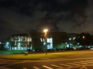
This is actually what you see when you leave Emerge. I thought it was amazing. 

I forgot which school this came out of but throughout the show, I realized that CSUN designs are more practical where as other school design to make things look pretty and cool. Im not sure if I would call this graphic design although it does look pretty cool.  

This is our professor Joe's piece. Joe is a graduate student at Cal State LA so he still qualifies to be in the exhibit. Pretty cool piece huh? 

I think this also came out of Cal State LA but I'm not too sure. These are Adobe CS4 promotional pieces.  

One of my all time favorite, this is made by Pui from CSUN. 

This one is made by Randall who also comes to CSUN. This really doesn't do the piece justice. Its just so much more amazing when its actual size and printed with the unique fold. 

I forgot where this one came from. It looks pretty cool but I don't really see a purpose to having it 3D. 

Another piece by professor Joe. And yes, that is my face on his piece. xD 

Probably best of show in my opinion. Its so pretty but its completely unpractical and will actually cost Converse way to much money to produce this for the market. It would have been ten times cooler if they actually put a pair of converses in there. 


Finally, here is our very own winner from CSUN. Its kim! Horray! Her piece is amazingly adorable and well designed. Tell her congrats if you see her.:] 

341: revised logo

Hellos! 

So I tried Jahaira's suggestion about losing the black outline around the fish. What do you think? 

341: logos

Hello all! Well I originally wanted to do Kauai but I have come to realize that it may be difficult to use only that city for the Olympics so I decided to switch to Hawaii instead and utilize all of the islands. (People would be traveling to different islands for each event) These are the logos I came up with. the left column is the evolution process of my fish. I really liked number 3 but I thought it would be better to actually use the Hawaii state fish  for the logo instead. (If your not sure how the state fish looks like, I included a picture at the end) The rest is just the icon with my experimentation with type. I feel like just having the text underneath the fish works best.  I think I like number 11 the best. What do you think? 


Heres the Hawaiian Trigger Fish for reference. 


thanks for looking! :D

446:: thumbs yamamotoyama

Hello all!  Here are my thumbs for the new logo of yamamotoyama. let me know what you think :] 


Also did some structure/layout thumbs for the new rebranding. 


Hope my sketches are clear.. and sorry again for the smudges. ~.~ 
Feedback is welcomed. :]

Also!  Remember to come to SAGA's open house tonight at 6:30 in the purple crit room. There will be free pizza! :D